Going Mouseless for a Day
Published on
Yesterday I decided to join Rob Conery in disconnecting my hand from my mouse for 'International Mouse Freedom Day'. What's more, this was a full real-life day at work rather than just a little experiment at home. The idea was that ditching the mouse and embracing the keyboard would speed everything up, make me more efficient and probably save the world.
Getting Ready
Unlike Rob, I didn't get everything ready ahead of time. My preparation consisted of turning on GMail keyboard shortcuts, installing gleeBox (which is awesome) and printing off a few keyboard shortcut crib-sheets. Not exactly a comprehensive set-up phase!
Diving In
My first impression as I began my day was that it wasn't all that bad. The combination of well-known browser shortcuts, plus gleeBox made web browsing pretty painless. I find the sensation of scrolling using either the arrow keys or page up/page down a little less tactile and involving than using a scroll wheel or my magic mouse, but sufficient. GMail's keyboard support is pretty good as well, if a little surprising at times.
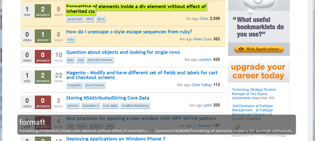
GleeBox allowed me to jump to any link on the page simply by typing (some of) it, and then follow it by hitting enter, or shift-enter for a new tab. It's not quite the same as browsing just with the power of your mind, but it isn't that far off. I soon found that the initial activation keys of g and . were less than ideal on sites like Twitter though, where it totally overrides their built-in shortcuts. I decided to swap the activation keys to ` and \ instead. Still right at my fingertips, but no conflicts with sites' own keyboard navigation.

Shining Beacons of Awesome...
Being restricted to using just the keyboard soon makes it clear which sites have got their keyboard-fu right and which haven't. Both Twitter and GMail were spot on. They both followed the convention of the j and k keys navigating the main list as well which was great, along with using ? to bring up a help screen showing just what keys to press for all the various functions. I can honestly say that Twitter was very comfortable after a short spell of acclimatisation.
Another couple of big ticks in the awesome box came courtesy of Visual Studio partnered with ReSharper, and surprisingly from Office 2010.
Whilst working in Visual Studio, I have a set of shortcuts which I commonly use anyway and am comfortable with - these carried on as usual and I found that I actually don't really need to use the mouse a huge amount anyway. My biggest drop in productivity was actually the ability to select (and manipulate) text. The inability to just right-click and have a vast list of options was also noticeable. All in all though, this aspect went very well.
Office 2010 was a pleasant surprise. It turns out that hitting F10 brings up little tooltips all over the ribbon illustrating what keys to press to pick various options. Very nice indeed! Dealing with the main area of Outlook didn't prove quite as enjoyable but having looked up a very lengthly list of shortcuts, I am confident that given more time, dealing with emails and calendars without the mouse would become reasonable.
... And Some Which Didn't Go So Well
Not everything was fluffy bunnies and rainbow-coloured unicorns. Some apps just didn't work very well mouseless. Indeed, this experience highlighted just how little thought I give this myself during development of an app or site.
The biggest 'oh dear' moment of the whole day was when I tried to use our own (intranet) application. The menu down the left has sections which can be expanded and contracted based on where you need to be. The only problem is, all of the contracted sections are totally inaccessible to keyboard-only users. It was impossible to tab to them, find them with gleeBox or anything else I could think of. Needless to say, I have pushed out a fix for that this morning!
I also figured I'd write this blog post, and popped my blog open to start a draft post with some notes. This site has no problems as such, since it was designed to be pretty accessible and such. All the hover effects are applied on focus, which is a massive plus. However, the Twitter and GMail experience is so much better that it made me wonder if I could enhance the keyboard support a bit on my own site, particularly from the point of view of adding/managing blog posts. I'm sure it is not the best it could be right now.
One of the most painful shocks of the day was about 10 minutes in when I wanted to use my Twitter client, MetroTwit. I could not use this without a mouse at all. I mean it was literally impossible. I could post a new tweet easily by using the Ctrl+N shortcut to focus the tweet textbox, but navigating the various columns and trying to reply or retweet... I just couldn't do it. In the end, I gave up and used Twitter.com for the rest of the day. That said, MetroTwit is still in beta and they freely admit that it is on the list of things to do, so for that reason I think it would be wrong to complain about it and it definitely won't stop me using it going forward. However it does show how much it is possible to rely on all these little applications during a normal day.
I also stumbled when I tried to use the webkit developer tools which come within Chrome. I got them open without any issue, but it all fell apart for me after that. It's possible it was me at fault here rather than the software, but I had to fall back to the mouse to get anything useful done.
There were a few other little gotchas throughout the day too. Windows Explorer you might think is fairly similar to a web browser. You have windows, which you can go backwards and forwards in. Each has a location bar. The only thing is, a lot of the shortcuts which work in (most) browsers just don't work there. Ctrl+L to get into the location bar like in Chrome and others would be great. It isn't the end of the world, but again it shows how well-known conventions can really help. Also, the Adobe Reader plugin (certainly in Chrome) didn't integrate quite as well as might be hoped. Hitting Ctrl+P to print brings up the browser's print dialog, rather than the plugin's (different) one. That resulted in me getting a lovely blank sheet with just headers and footers. I never did find out how to get to the plugin's print button using the keyboard.
Slow Going
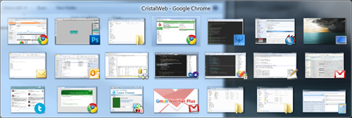
Something which took me a little by surprise was the amount of effort it took to switch between windows. I'm not quite sure where this pain came from, but I actually had to think about which window it was that I needed. When I use the mouse and switch between windows and monitors, it seems that I make the cursor follow my eyes and click to activate windows almost subconciously. Taking that away meant fumbling (and that really is the only word I can use for this) with Alt+Tab and searching through the list of windows for the one I need. Maybe I keep too much open, but I hardly think that's a decent excuse. On a related note, it also illustrated the need for it to be obvious what currently has focus, both in terms of the actual window and the controls within. Not everything was as good as one might wish for on this front.

I discovered about mid morning that sometimes you just need the right-click menu. Since I use an Apple keyboard (I prefer typing on them), I didn't have the little right-click popup menu key. Since I run AutoHotKey on my machine to deal with a few key remappings, I simply added one for this key on F14. Whilst I was there, I remapped F13 to Print Screen since I didn't have that either. Problem solved.
A Learning Process
As I freely admit, and others have pointed out, I am quite a mouse-happy person and not exactly a keyboard ninja. Going from mediocre to master in a day was never going to happen. What I wasn't quite prepared for though was the uncomfortable feeling that an integral part of my body/computer interface has been removed. It faded as the day went on, but I am definitely more comfortable when I have a mouse there next to the keyboard.
I think the most valuable lesson which I will take away from this is to give some thought to keyboard navigation when building something. It really does make a world of difference. It also demonstrates the importance of having a good set of conventions and following them. Consistency is definitely key here.
 Another small point I picked up on during my failing attempts to use Google Analytics without a mouse is that things which rely on hover effects just don't exist to you. There is nothing to hover with. Most of the page was fine, but hovering over the points in the graphs to get the little stats which pop up... well I couldn't do it. Out came the mouse again.
Did It Work?
So... can you go a whole day without a mouse? No, not really. Not without pain and a sizeable drop in productivity anyway. But better use of the keyboard can definitely go some way to making you more efficient. It seems to me that the best thing is to keep the mouse by my side, but try to be just that little more keyboard-biased where possible.
Was a whole day without the mouse a success? No, definitely not. The fact that I had so many problems and had to fall back to the mouse on several occasions proves that. But was it a failure? No, I don't think so. Some good lessons have come out of it, and I think it was worth the effort, just for the sake of experimenting.