Monitoring My Energy Usage (Part 3)
Published on
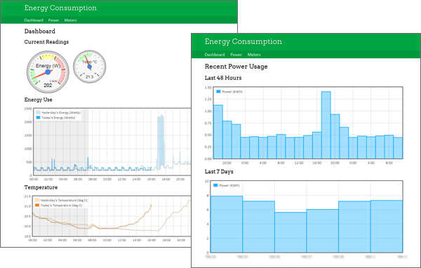
In parts 1, 2 and 2a, I set up my Current Cost device and built a small app for logging all the data into a MongoDB database. It is now time to delve into displaying the data by exploring the Rails-based web front-end I have been (and continue to be) working on.
Requirements
The goals for this app are as follows:
- View current usage and temperature (the readings as of "right now")
- Compare against yesterday's usage/temperature
- View the amount of power (kWh) used recently
- Yesterday/today up until the last 2 hour block sent from the device
- Last week
- Last month
- Explore historic usage
- What did I use over the last several months?
- How does this year compare with last year?
- How does the time of year affect things?
There is nothing here which is particularly difficult, it is simply a case of presenting the appropriate subset of the data in a simple and appealing way and ensuring the app doesn't do anything unexpected or undesirable with it.
Ingredients
I've decided to build this as a Rails 3 app as it is something I have a little bit of experience with and would like to play with some more. I find the Ruby language particularly pleasing, along with the whole Ruby and Rails way which just gets out of the way and lets you focus on your app.
I have opted to use Mongoid for mapping objects to/from the database. The reason is primarily the fact that it is easy and I've played around with it before. It also allows easy dropping down to the standard Mongo Ruby driver where necessary. To be honest, I could have achieved exactly the same just as easily using MongoMapper or even just using the Mongo driver straight up throughout.
Current Readings
As I've mentioned previously, the device gives an instant readout of the current energy usage (watts) and current temperature (°C) and these are updated every 6 seconds and logged into the DB every time.
I think a rather nice way of displaying this sort of 'instant' data is to display it in dial or gauge form. I have been working on a way of using canvas to create dials, but it isn't really ready for prime time yet, so I found an ideal alternative in the form of the Google Visualisation API Gauge. This allowed me to set up a couple of dials and indicate the ideal and less ideal sections by adding a green, yellow or red area between given values.
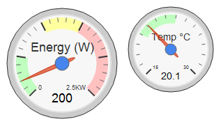
Since these dials are the current readout, I have set them up to be updated every few seconds. The latest readings are retrieved from the server via an AJAX call in JSON form, and these values are used for the dials. As an added bonus, the dials animate the needle up or down when a change is made, which just adds that extra touch. Of course, with all these things though, it's not all happy hippos and dancing rhinos: the dials do not work very well at all on an iPhone. The only parts which are shown is the text (labels and current value) and even that isn't done very well. For now, it's not a massive issue but in the future it is something I'd like to address. Likely it'll be accomplished by replacing the dials with a different implementation.
Recent Energy Usage & Temperature
In addition to the "right now" readings, I'd also like to show both today's and yesterday's energy usage throughout the day, along with temperature. For this, a couple of line graphs are ideal; one for energy and one for temperature.
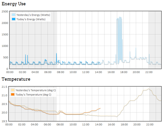
These graphs are created using the excellent Flot, a jQuery plugin which uses canvas to create really nice looking graphs. It is simply a case of feeding it some data (prepared into an appropriately structured JSON array server-side) and some options along with telling it where on the page the graph should go.
Like the dials above, these graphs are updated regularly via AJAX (although not as frequently because the map-reduce task which creates the average readings to be plotted runs every 15 minutes at present). This means I can open up the page and simply leave it, and know that whenever I look at it, it will be (near enough) the most up to date data available.
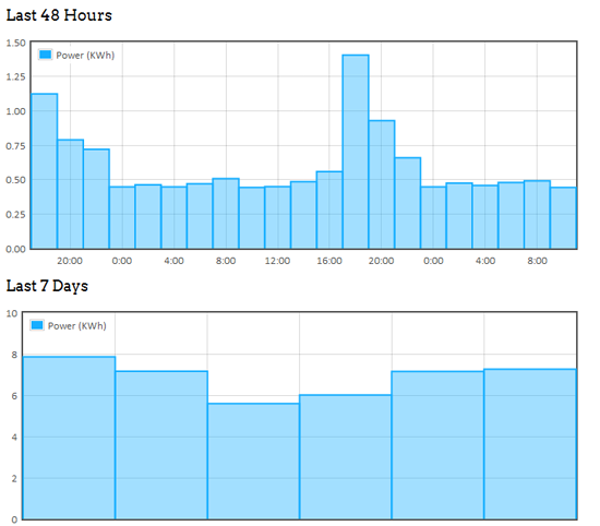
Power Usage Graphs
In addition to the recent energy/temperature graphs, I also want to display power usage graphs (kWh) for the two-hour blocks the Current Cost gives me, and the daily blocks. Since these are all logged into the database, this is once again just a case of pulling the data out and sticking it into a graph format. This time they are bar graphs, since each block has a discrete value ("between 15:00 and 17:00, 0.9kWh was used") and Flot allows us to make bar and line graphs equally easily.
What's Next?
Now that I have some of the basic requirements done, I am going to add the ability to dig into past data. It would also be nice to come up with some kind of comparison method as well to allow two different periods to be compared and contrasted in some way. In addition, perhaps some sort of indication whether consumption is rising or falling would be useful as well, although I'm not totally sure how that would work in a sensible way yet.
The general look and feel of the app is something else I'd like to improve on. It works perfectly well as it is, but it isn't exactly inspiring to look at and I'm certain it can be bettered.
Another bit of functionality I'd like to built in at some point is the ability to display the power used in money (£) as well as kWh. Of course, that would require telling the app about how much each kWh costs (which isn't as straightforward as it could be due to the fact some are charged at a different rate to the other and I don't know the rule...). However I expect my energy company can provide that information easily.
I'm hoping to build out some more of this over the coming weeks. Chances are that'll feature in a fourth part to this series.